Module 7: Differential Expression Comparison (compare_stage)
In multi-sample spatial transcriptomics studies, two questions are often central: which genes change significantly between experimental groups, and which biological processes or pathways are associated with those changes.
The compare_stage module is designed for precisely this purpose. After integration and annotation, it performs cross-sample differential expression analysis for a selected cell population or tissue region and generates statistical tables, summary figures, and enrichment results automatically.
In this section, we continue with the integrated and annotated mouse brain example from Spatialsnake for multi-sample integration.
For the configuration reference, see compare_stage.yaml Reference.
What does this module do?
Compare biological groups defined in ``sample.txt`` The workflow reads the grouping information from
sample.txtand treats samples assigned to the same label as one experimental condition. These group names are used not only in the statistical model but also in result tables, directory names, and figure legends.Focus on a selected cell type or region If
cell_focusis set, the analysis is restricted to the specified cell population or tissue region, such ascortex,CAF, orT_cell.Run differential expression statistics When each condition contains sufficient replicate samples, the module prioritizes DESeq2-style pseudobulk analysis. With smaller sample numbers, it can switch to edgeR for greater stability.
Generate interpretable summary figures The workflow exports volcano plots, DEG barplots, log2FC density plots, MA plots, and contrast-level heatmaps.
Perform downstream functional enrichment Significant genes are carried forward into GO, KEGG, and GSEA analyses to identify enriched biological programs and pathway-level differences.
Prepare the input files
compare_stage is best run with the same sample table used in compare_analysis. Unlike single-sample analysis, the third column should contain the true biological group name.
sample_id   input_path       group
ST8059048  data/ST8059048   Group1
ST8059049  data/ST8059049   Group1
ST8059050  data/ST8059050   Group1
ST8059051  data/ST8059051   Group2
ST8059052  data/ST8059052   Group2
Input requirements:
Before entering this step, you should already have completed
annotationundercompare_analysis.groupshould include at least two real experimental conditions, such asControl,Disease,WT,KO,Tumor, orNormal.These group names are written directly into result tables, contrast labels, legends, and enrichment directories, so choose biologically interpretable names.
cell_focuscan be used to restrict the analysis to a specific cell type or tissue region. If it is left empty, the workflow analyzes the full aggregated target set.
Common parameters
Parameter |
Typical values |
Description |
|---|---|---|
|
|
Selects the differential expression comparison branch |
|
|
Preferred differential expression algorithm |
|
|
Cell type or tissue region to focus on |
|
|
Species background used for enrichment analysis |
|
|
Significance threshold for volcano plot labeling and DEG filtering |
|
|
Absolute log2 fold-change threshold; larger values are more stringent |
In this example, we use cortex as cell_focus to compare the same anatomical region across experimental conditions. If your study focuses on a specific cell population instead, replace cell_focus with the corresponding cell-type label.
compare_algorithm: 'DEseq2'         # DESeq2 or edgeR
cell_focus: "cortex"                # target cell type or tissue region
species: 'human'                    # human or mouse
cut_off_pvalue: 0.05                # adjusted p-value threshold for volcano labeling and DEG partitioning
cut_off_logFC: 1.5                  # absolute log2 fold-change threshold for DEG partitioning
Run the workflow
spatialsnake compare_analysis sample.txt visium --option=compare_stage --runpipe=compare_gene --cell_focus=cortex
Result file structure
The workflow outputs figures in PNG format and also creates group-specific directories, allowing immediate identification of genes that are more highly expressed in each biological condition.
results/
└── merge_data/
    └── compare_analysis/
        ├── marker_genes_pval.csv
        ├── diff_all.csv
        ├── volcano.png
        ├── top_deg_barplot.png
        ├── log2fc_density.png
        ├── ma_plot.png
        ├── contrast_summary.csv
        ├── contrast_summary.png
        ├── contrast_log2fc_heatmap.png
        ├── diff/
        │   └── {groupA}_vs_{groupB}.csv
        ├── positive/
        │   ├── diff_genes.csv
        │   ├── diff_strict.csv
        │   ├── diff_loose.csv
        │   ├── GO_data.csv
        │   ├── kegg_data.csv
        │   ├── GO_enrich.png
        │   └── KEGG_enrich.png
        ├── negative/
        │   ├── diff_genes.csv
        │   ├── diff_strict.csv
        │   ├── diff_loose.csv
        │   ├── GO_data.csv
        │   ├── kegg_data.csv
        │   ├── GO_enrich.png
        │   └── KEGG_enrich.png
        ├── higher_in_{groupA}/
        │   ├── diff_genes.csv
        │   ├── diff_strict.csv
        │   ├── diff_loose.csv
        │   ├── GO_data.csv
        │   ├── kegg_data.csv
        │   ├── GO_enrich.png
        │   └── KEGG_enrich.png
        ├── higher_in_{groupB}/
        │   └── ...
        ├── gsea/
        │   ├── GSEA_GO_data.csv
        │   ├── GSEA_KEGG_data.csv
        │   ├── GSEA_GO_plot.png
        │   └── GSEA_KEGG_plot.png
        └── {contrast}/
            ├── diff_all.csv
            ├── volcano.png
            ├── top_deg_barplot.png
            ├── log2fc_density.png
            ├── ma_plot.png
            ├── positive/...
            ├── negative/...
            ├── higher_in_{groupA}/...
            ├── higher_in_{groupB}/...
            └── gsea/...
Notes:
If the selected cell type has limited sequencing quality, if the data are extremely high resolution, or if the experimental conditions are very similar, the DEG signal may be weak and enrichment may be less informative.
When multiple pairwise contrasts are present, each contrast is written to its own
{contrast}subdirectory.positiveandnegativeretain the traditional up/down classifications used in older workflows.higher_in_{groupA}andhigher_in_{groupB}are generally more intuitive for direct biological interpretation.
How to interpret the results
1. Volcano plot (volcano.png)
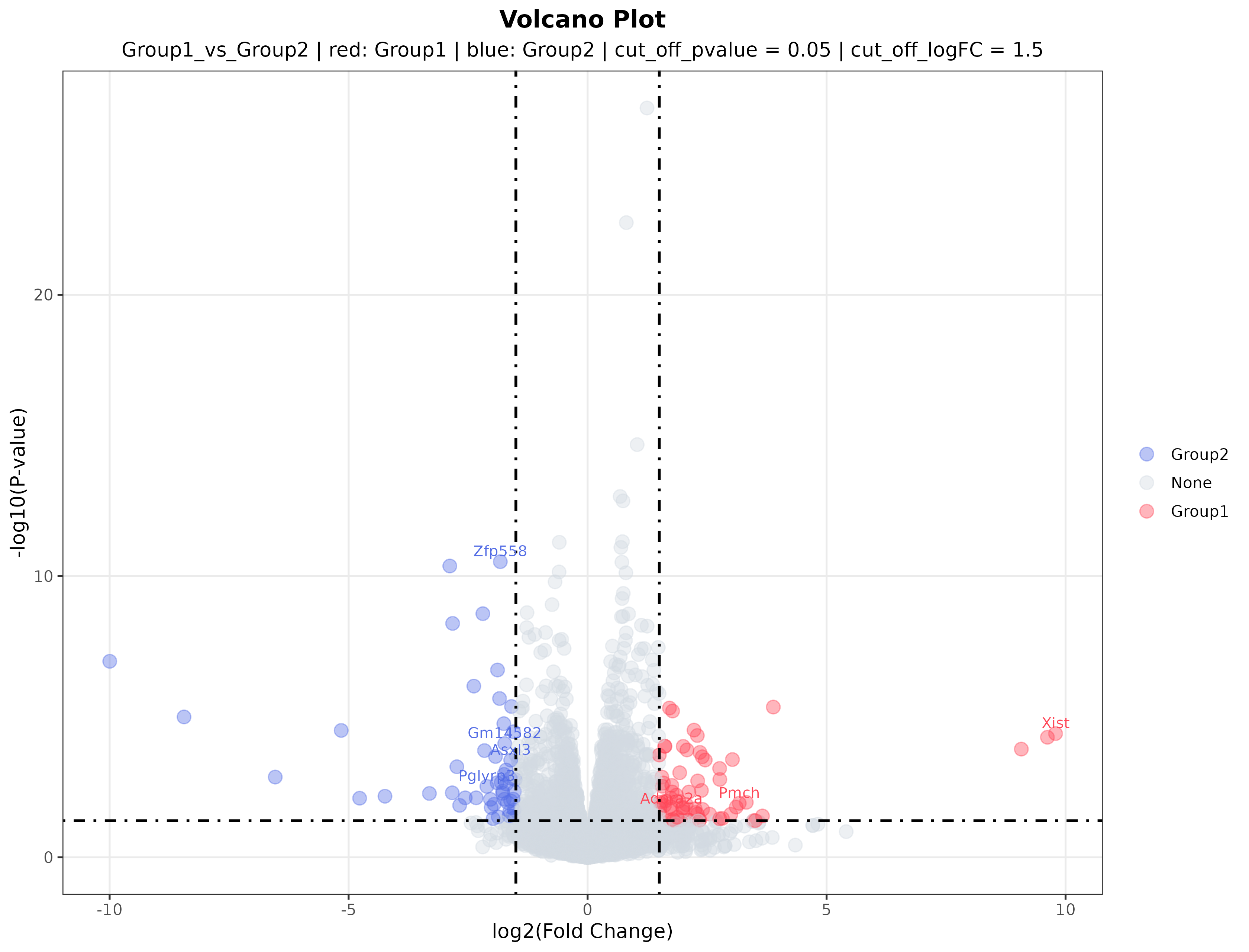
Interpretation: The volcano plot summarizes both effect size and statistical significance. The x-axis represents fold change between the two groups, and the y-axis represents statistical significance. Red and blue points indicate genes more highly expressed in one of the two experimental groups, whereas gray points do not meet the selected threshold. Labeled genes are typically among the most prominent candidates for validation or literature follow-up.
2. DEG bar plot (top_deg_barplot.png)
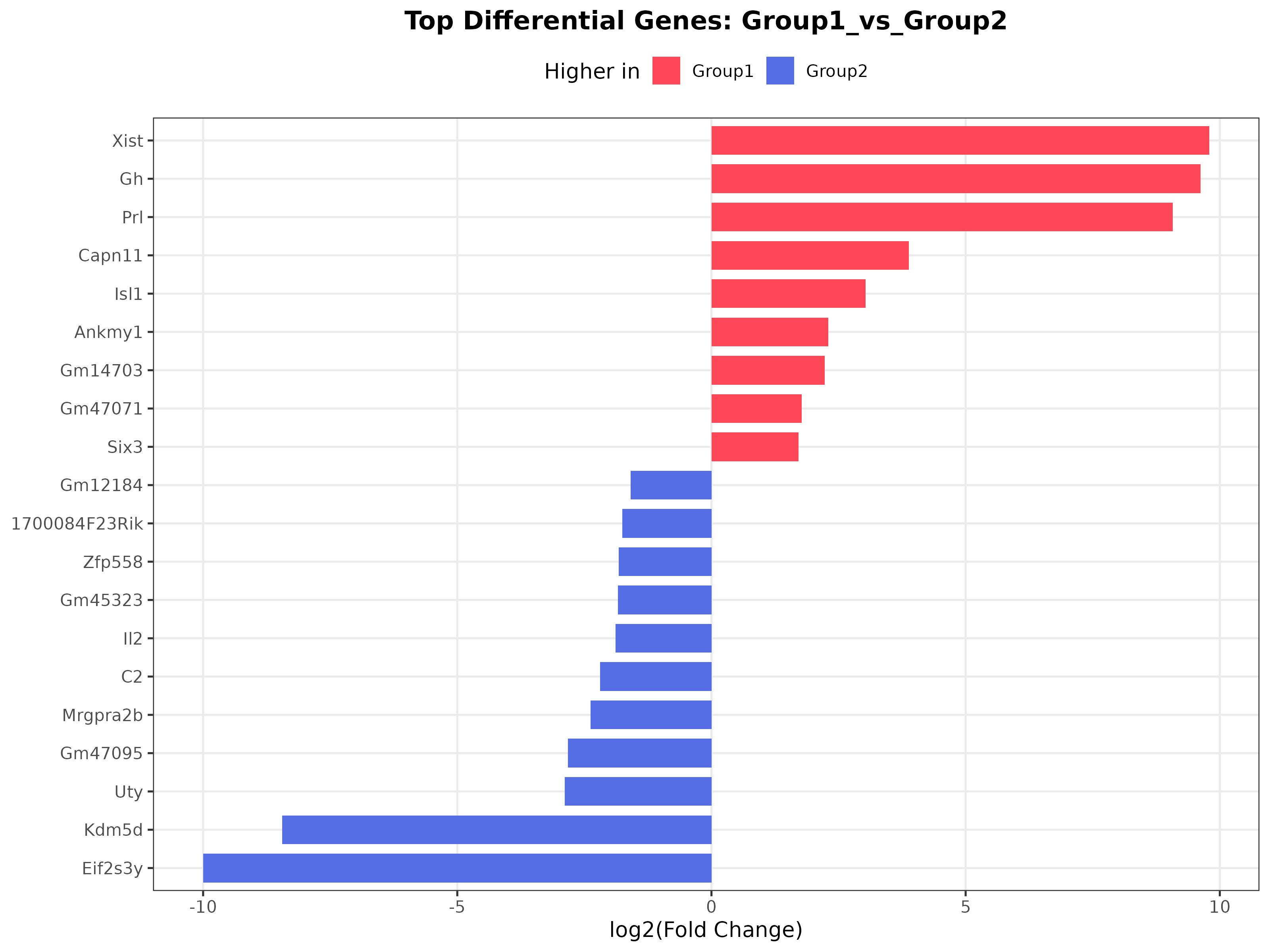
Interpretation: This plot highlights the most strongly changing genes. Different colors represent genes preferentially expressed in different groups, making the figure a convenient visual shortlist of candidate markers.
3. MA plot
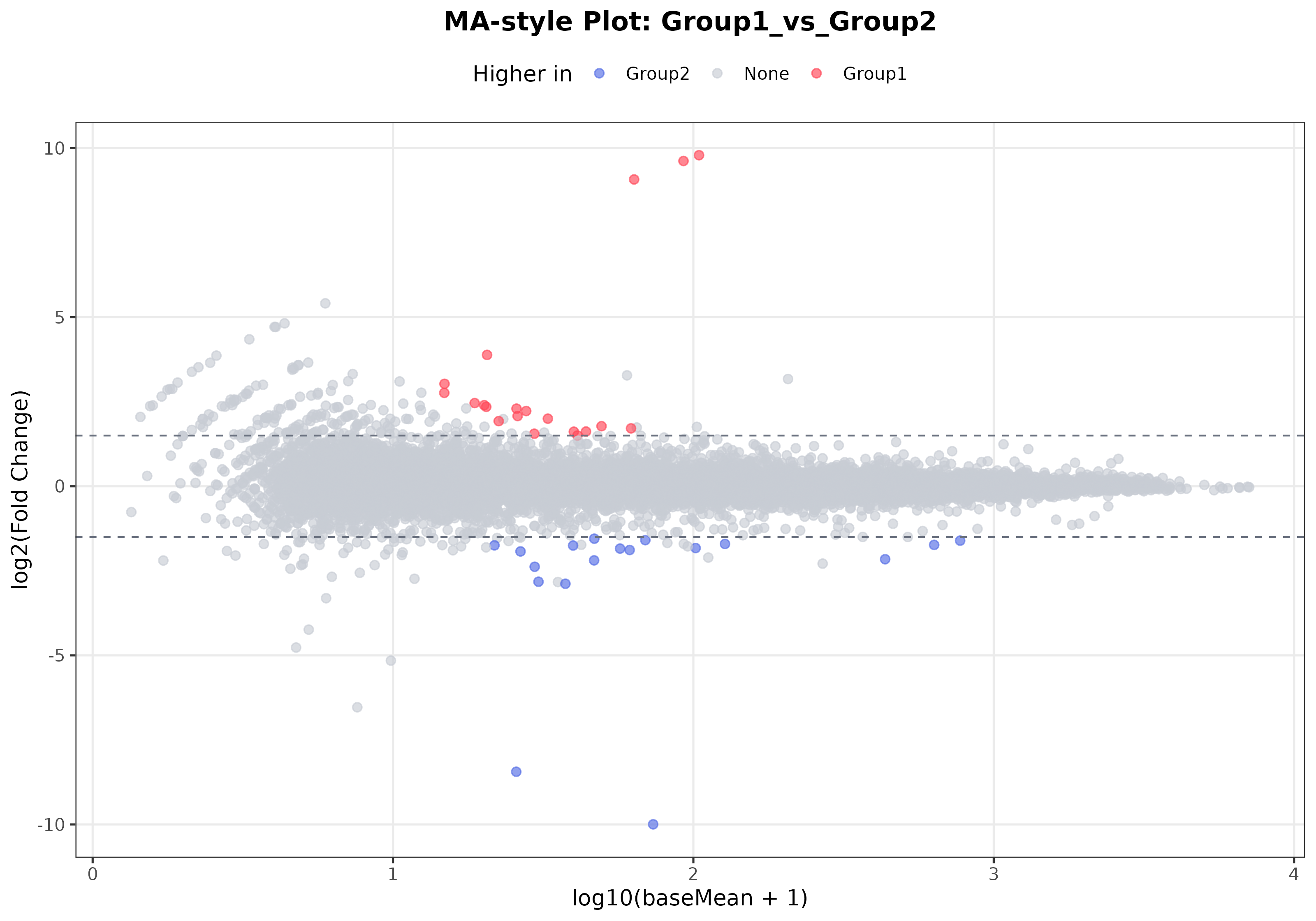
Interpretation: The MA plot emphasizes the relationship between expression abundance and differential expression. It helps determine whether significant changes are driven mainly by highly expressed genes or are concentrated in the low-expression range. When many significant genes fall in the high-expression range, the result is often more stable and easier to interpret.